WEB DESIGN

GANVEE
Targeted Audience: 18+ plant-based men and women
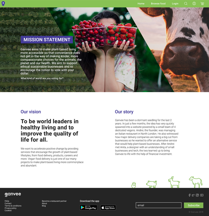
My client wanted me to establish the branding of his new startup which was essentially going to be the vegan Deliveroo / Uber Eats. He wanted the brand to appear friendly, positive, clean and modern.
What I enjoyed the most was implementing features and functions I found to be missing from existing online delivery platforms at the time, such as searching for specific dishes and being able to rate dishes as well.
Unfortunately the project was pulled months down the road.
Please use the arrows on either end to navigate the gallery:
BRANDING


A few grabs from a Brand Guidelines PDF I put together for our developer and future designers.

LOGO DEVELOPMENT


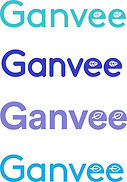
Stage 1: I compiled a palette of colours and San Serif fonts
Stage 1: I also had the idea to incorporate a leaf into the letters to play up the plant-based theme of the brand
Stage 2: my client decided on a colour for the logo and wanted more options for fonts
Stage 3: I developed the leaf idea more once we decided on a font
Stage 3: I had the idea to incorporate a shortened version of the text logo into a visual - a G as an avocado pit
FINAL LOGOS

We decided on the final icon logo based on testing various line thicknesses and font size of the 'g' in context as an app icon


